Anticipating Post Pandemic Design Trends
Is a design revolution on the way? History says yes.
A new decade tends to usher in new design trends, but 2020 is turning out to be much more than just anew decade. As we look forward to finally breathing a sigh of relief, once COVID-19 heads for the history books, now is the time to prepare for what’s next.
Seismic shifts and societal aftershocks stemming from the global pandemic stand to reframe how we view and interact with the world, and that includes digital brands and their websites. Design is inextricably linked to world events and there is no doubt that the economic, emotional, and political impact of COVID-19 has rocked the collective psyche to the very core.
During stay-at-home lockdowns, the web was catapulted into the primary means of connection. Chances are, the strengthened online attachments made over the past few months aren’t going away. Moving forward, “normal” will look a lot different than how we remember it.
Chances are, the strengthened online attachments made over the past few months aren’t going away. Moving forward, “normal” will look a lot different than how we remember it. What does this mean for your website? How can you ensure that your online presence aligns with emerging expectations, current concerns, and new preferences for staying connected and conducting business?
Looking Back to Look Forward
For perspective on the design approach that will resonate with your audience, let’s take a quick look back to the design revolutions that followed major global upheavals from past decades — starting with the last time that world was gripped by a pandemic that rivaled COVID-19.
Of course, digital experiences were not a factor for much of the previous century, but many of the same principles apply. Whether we are talking about color choice, fonts, building facades, or refrigerators, design has a powerful impact, even when — often especially when — it registers on a subtle or unconscious level.
From Pandemic to Prosperity
 Immediately following the devastation of World War I, which killed 40 million people worldwide and more than 5 million Americans, one-third of the world’s population became infected with the Spanish Flu. More than 20 million people died as a result, including 675,000 Americans.
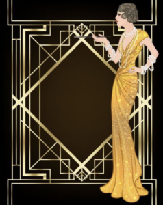
It’s hard to imagine a series of events that sparked a more desperate need for optimism and a determination to reshape a vision for the future that was driven by positive energy. Enter the Roaring Twenties: Modernist designs, marked by innovation and experimentation vs. realism and the rules of the past were the primary influences during this era. It was a time of fun, flashy and opulent design with gold as a dominant color and art deco as the signature style.
Then: The Crash
The Great Depression of the 1930s marked a sudden and sweeping turn in economic realities. It sparked another design revolution that reflected efforts to lift up a population who was dealing with tremendous loss and uncertainty. Bright colors and positive messaging were intended to spark optimism and hope.
Streamline moderne emerged as a new architectural style that emphasized industrial materials such as concrete and glass, along with smooth curves. A lack of ornamentation and sharp angles aligned with the economic austerity of the times, while unexpected colors injected bright spots into the dreary realities of the day.
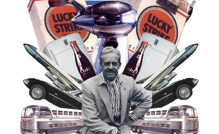
A signature Depression-era design achievement was the Sears, Roebuck & Company’s decision to hire industrial designer Raymond Loewy to redesign its Coldspot refrigerator in 1934 in an effort to create excitement about the appliance and encourage consumers to shop. Touted as a “single, smooth, gleaming unit of functional simplicity,” the redesigned Coldspot sparked a fivefold increase in sales of the appliance for Sears between 1934 and 1936. This well-known industrial designer began to redesign the style of everyday things emphasizing the many possibilities of the future.

Onward and Upward
During World War II, iconic propaganda posters fueled the war effort with messages that urged specifications, while conveying unity, strength and the ultimate triumph of good over evil. As the war ended, the United States was quickly catapulted into the “atomic age,” which encompassed the years of 1945 through 1963.
Atomic Age design trends reflected a determination to redirect the world away from one of history’s darkest chapters, while harnessing the war’s massive destructive capabilities for scientific achievements that would have a positive impact on humanity.
 Abstract designs, bright colors (turquoise was huge) and graphic elements inspired by science and space emerged as dominant design devices that represented a bright future of boundless possibilities.
The “boomerang” emerged as a signature motif of the 1950s, along with designs that suggested galaxies, planets, stars and space travel.
Radical and Rebellious
Post-war optimism took a nosedive in the late 1960s and 1970s, as the Civil Rights movement, along with opposition to the draft and the war in Vietnam, fueled widespread unrest and antagonism toward authority. Psychedelic designs that featured bright and unexpected colors, kaleidoscopic patterns, and groovy typography reflected an emerging youth culture noted for rebellion and a determination to be seen and heard.

The Next Big Downturn
Throughout the 20th century, graphic design served as an essential tool for shifting societal gears following crises and setbacks. As we entered the age of digital communications, rapid change and heightened competition called for far more rapid response to evolving user needs and expectations.
Let’s fast forward to 2008 and the Great Recession that followed the sub-prime mortgage crisis and the near collapse of global financial markets. At this point, the web had long since entered into the mainstream as a critical component of consumers’ connection to the world. The rise of “Web 2.0” was allowing for widespread sharing, interaction, and connection via social media and commenting capabilities.
As the Great Recession sparked distrust in mega-corporations and complicated, behind-the-scenes financial dealings, it fueled the rise of simple, web capabilities that offered transparency, no-nonsense, and value. Digital natives for whom online interactions were second nature, drove the growth of direct-to-consumer brands such as Warby Parker, Casper®, and Blue Apron.
 Popular designs trended toward unintimidating colors, most notably “millennial pink,” along with minimalism and simple, clean graphics.The elegant simplicity of Apple’s design sensibility is emblematic of this era. As the streamlined iPhone ushered in a new era of simple access to information, web designs adopted to accommodate multiple formats.
What’s Next? Post COVID-19 Design
I am not suggesting that COVID-19 is behind us, but as we proceed with hope and caution toward that point, we are devoting a depth and breath of empathy and insight into the types of redesigned digital experiences that will effectively resonate with audiences. While the pandemic had and is having a distinctly different impact on every household and every individual, it’s fair to assume that varying degrees of post-traumatic stress will accompany adjustment to the new normal.
It seems no surprise that Pantone has predicted the color trend with their Pantone Color of the Year 2021: Pantone 17-5104 Ultimate Gray + Pantone 13-0647 Illuminating. This color combination is described on the Pantone website as, “a marriage of color conveying a message of strength and hopefulness that is both enduring and uplifting.” Similar to the stable black and gold of the 20’s following the preceding pandemic.

The concept is essential, people need connection and some cheering up after the events of 2020. Confined to their homes, audiences have spent more time on the web than ever before. Chances are, they’ve experienced sites that offered excellent, streamlined navigation, sites that were frustrating, and everything in between. Moving forward, the bar is high, and like never before, audiences will appreciate impeccably designed web experiences that reduce their friction towards achieving more connection and joy.
As websites and digital experiences are being called upon to connect and communicate more so than ever before, we look for brands to provide seamless UX to reduce frustration in an already frustrating world, colorful and bright imagery to pull us out of our doom scrolling, and personal warm messaging that is relatable considering our shared experience with disturbing current events. Being tone deaf to what has fallen upon the world as a whole reflects a brand is unconcerned and selfish and will dim amidst the surgence of more modern, uplifting brands. Brands will do their part to adapt and communicate their sense of belonging, connection, and optimism towards a brighter future – starting with taking a hard look at their current brand and asking themselves if it is still relevant to this new post-pandemic world.
Originally published on prometsource.com – May 27, 2020
Edited – December 19, 2020


