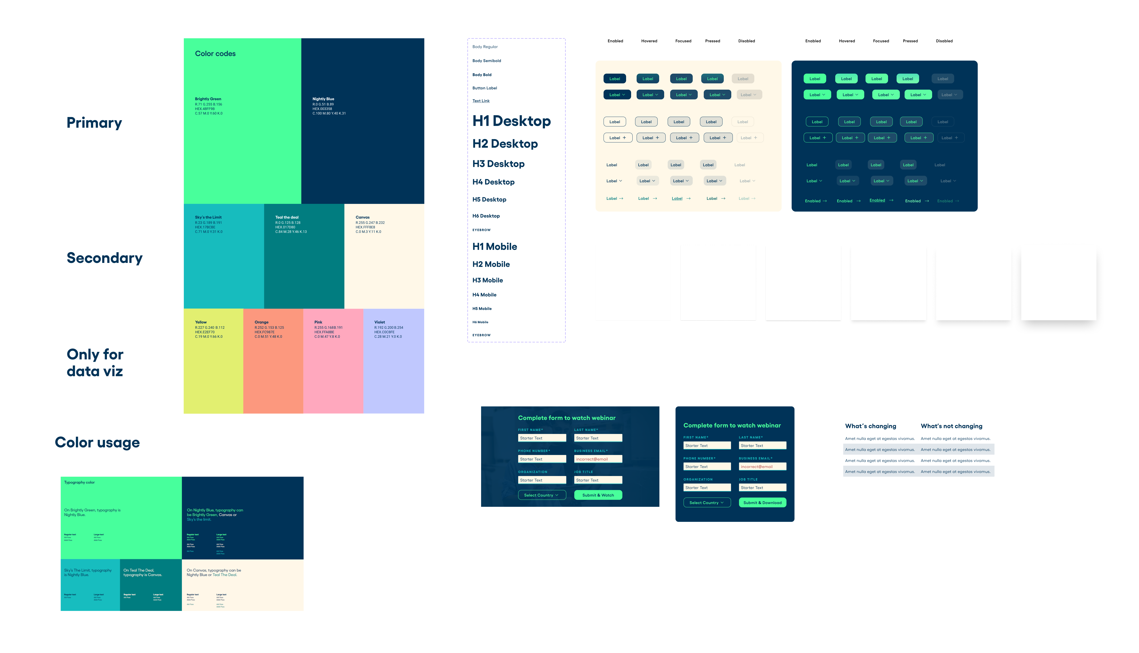
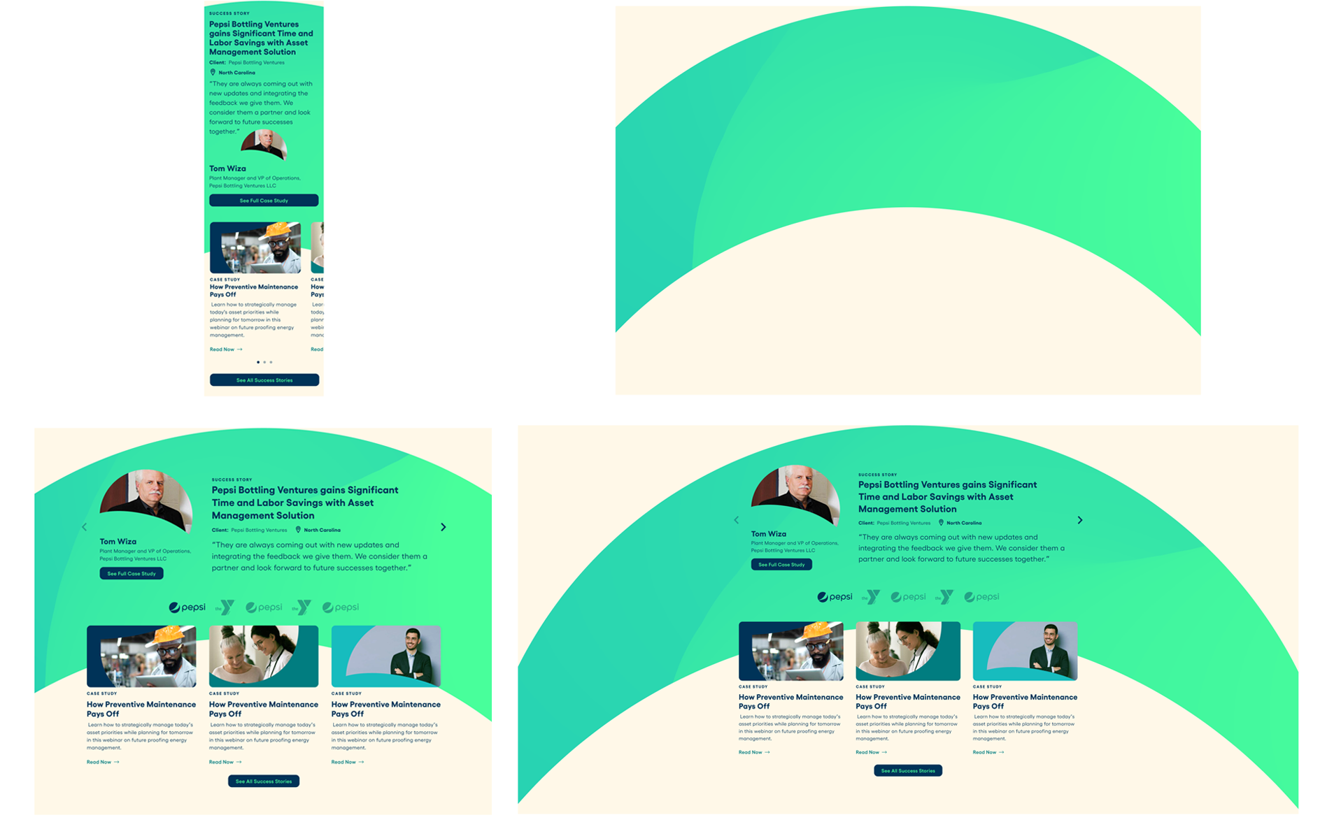
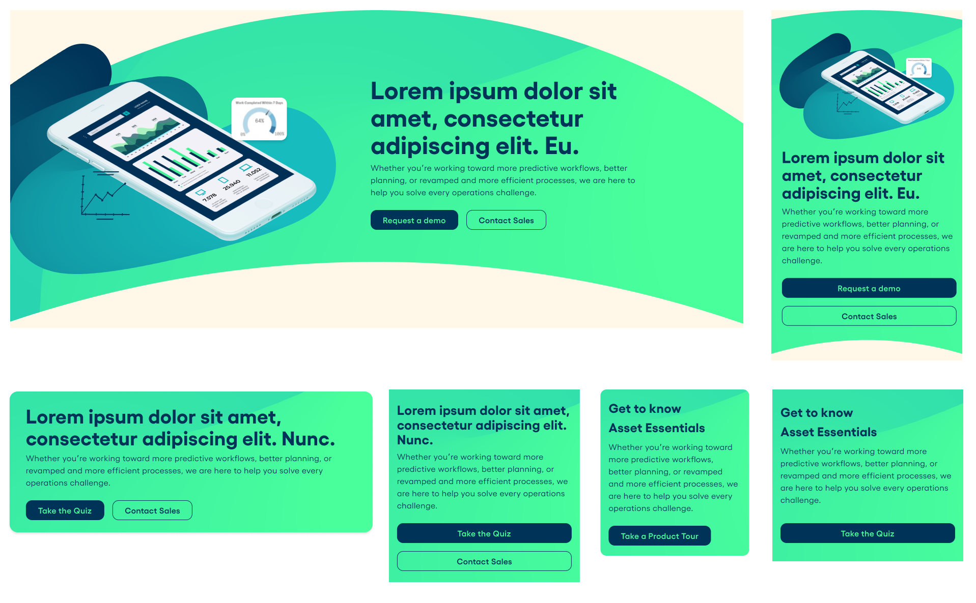
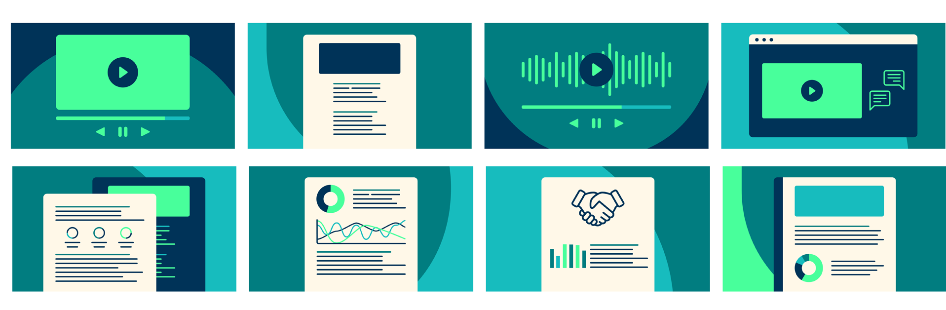
Meet Brightly

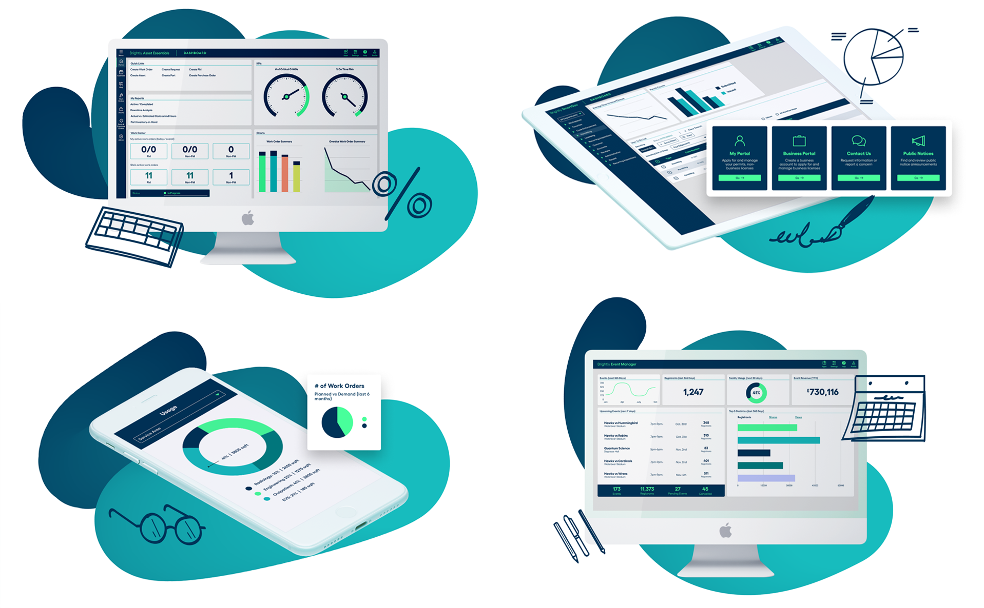
Brightly Software, formerly Dude Solutions, is a leading SaaS provider for operations management. After a series of acquisitions they needed to reach a global audience and reposition themselves as a solutions provider. We worked with the Dude team and their partner agency, Archetype Brands, to activate their new name and identity to the digital space.

The new site became a high-performing lead generation platform resulting from months of prior UX optimization with Dude Solutions. This rebranded new digital presence immediately resulted in a 65% increase in Contact Requests, 34% increase in Demo Requests, and a 36% decrease in Bounce Rate. The noticeable repositioning from product suites to a solutions-focused platform culminated in an acquisition by Siemens.

The Result

Collaboration with the brand agency while the brand development was in process helped to define the visual style that embraced the feeling of Brightly while also considering user needs for readability and accessibility. Conversion rate optimization (CRO) was a core focus of the new design while presenting an approachable, friendly, and helpful brand image.

Playful elements and flourishes throughout the site increased user engagement, content consumption, resulting to an increase in lead generation from contact forms and demo requests.

A Conversion-Centered Approach

The core focus of the site was to consider critical conversion points for users and to help create a meaningful journey for them, driving them to offerings and opportunities to be educated and supported by the Brightly team.

Information Architecture

Competitive research and user testing contributed to the information architecture (IA) to position Brightly as a solutions provider while also providing a user-friendly navigation.

Wireframe Page Layouts

Stemming from the skeleton provided through IA, the framework of the site took on a life of it’s own as pages hierarchy and conversion-focused page layouts took shape.

Design System

With a foundation of component-based design, the design system provided reusable, responsible blocks for use with a content management system (CMS) for a scalable digital experience platform.

Responsive Components

With a foundation of component-based design, the design system provided reusable, responsible blocks for use with a content management system (CMS) for a scalable digital experience platform.

Flexible components and responsive states were considered for a multitude of screen sizes from narrow mobile devices to wide screen monitors – as well as the column widths for the CMS platform.

Brand Extension

A set of pictograms were created as default state imagery for resources in the Resource Library containing blog articles, press releases, webinars, video, news and more.

Product UI

An simplified and abstracted SaaS product UI was created for each of the features and suites to align with the new brand. The mocked up screens of the Brightly SaaS platform demonstrated a more compelling and attractive digital experience to prospective customers while the existing product UI was being redesigned.

One page I hope you don’t see.

The 404 page. A delightful experience in a time of error brings a positive brand resonance and a smile of delight to users looking to return to their journey.

UX and Creative Director

Mindy League

UX Strategist

Lindsay Derby

Information Architecture

Michelle Scott

Visual Design Lead

Lucas Raschbacher

UX Coordinator

Christy Clonts

Brand Agency

Archetype Brands